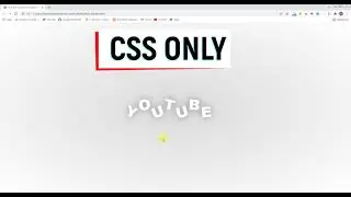
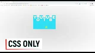
Cool Text Hover Effect In CSS Part 3
Cool Text Hover Effect In CSS
/*CSS*/
*,*::before,*::after{
padding: 0;
margin: 0;
box-sizing: border-box;
}
body{
width: 100%;
min-height: 100vh;
background-image: radial-gradient( #D9D9D9, #FFF );
display: grid;
place-items: center;
font-family: sans-serif;
}
.container{
display: grid;
grid: repeat(3, 1fr)/repeat(3, 1fr);
}
.container span{
width: 200px;
height: 200px;
z-index: 0;
}
.container h1{
font-size: 5rem;
color: #FFF;
font-weight: 900;
text-shadow: 0 0 2px rgb(0, 0, 0);
position: absolute;
left: 50%;
top: 50%;
transform: translate(-50%, -50%);
text-transform: uppercase;
transition: all 0.5s ease-in-out;
}
.container h1:hover{
text-shadow: 0 0 30px rgb(0, 0, 0);
}
.container span.hover.one:hover~h1{
left: 55%;
top: 55%;
}
.container span.hover.two:hover~h1{
top: 55%;
}
.container span.hover.three:hover~h1{
left: 45%;
top: 55%;
}
.container span.hover.four:hover~h1{
left: 55%;
}
.container span.hover.five:hover~h1{
text-shadow: 0 0 30px rgb(0, 0, 0);
}
.container span.hover.six:hover~h1{
left: 45%;
}
.container span.hover.seven:hover~h1{
left: 55%;
top: 45%;
}
.container span.hover.eight:hover~h1{
top: 45%;
}
.container span.hover.nine:hover~h1{
left: 45%;
top: 45%;
}
Watch video Cool Text Hover Effect In CSS Part 3 online, duration hours minute second in high quality that is uploaded to the channel Masters In Web Design 15 January 2022. Share the link to the video on social media so that your subscribers and friends will also watch this video. This video clip has been viewed 8 times and liked it 2 visitors.