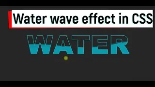
Water Wave Effects in CSS Part 2
How to make water wave effect on text in CSS
/*CSS*/
*,*::before,*::after{
padding: 0;
margin: 0;
box-sizing: border-box;
}
body{
width: 100%;
min-height: 100vh;
background: #222;
font-family: sans-serif;
}
body h1{
font-size: 10em;
font-weight: 900;
text-transform: uppercase;
color: transparent;
position: absolute;
top: 50%;
left: 50%;
transform: translate(-50%, -50%);
}
body h1:nth-child(1){
-webkit-text-stroke: 2px rgba(0,188,212,1);
}
body h1:nth-child(2){
color: rgba(0,188,212,0.7);
animation: waterWave 4s ease-in-out infinite;
animation-delay: 0.3s;
}
body h1:nth-child(3){
color: rgba(0,188,212,0.4);
animation: waterWave 4s ease-in-out infinite;
animation-delay: 0.5s;
}
body h1:nth-child(3){
color: rgba(0,188,212,0.2);
animation: waterWave 4s ease-in-out infinite;
animation-delay: 0.7s;
}
@keyframes waterWave{
0%,100%{
clip-path: polygon(0% 42%, 14% 44%, 28% 49%, 37% 54%, 48% 59%, 61% 62%, 72% 61%, 82% 57%, 91% 51%, 100% 47%, 100% 100%, 0 100%);
}
50%{
clip-path: polygon(0 73%, 9% 69%, 17% 64%, 24% 61%, 38% 58%, 54% 60%, 69% 55%, 78% 50%, 89% 42%, 100% 40%, 100% 100%, 0 100%);
}
}
Watch video Water Wave Effects in CSS Part 2 online, duration hours minute second in high quality that is uploaded to the channel Masters In Web Design 25 January 2022. Share the link to the video on social media so that your subscribers and friends will also watch this video. This video clip has been viewed 26 times and liked it 4 visitors.