Responsive Web Design | 6 Effective Tips - CSS Tutorial 102
Notes for You:: Responsive Web Design | 6 Effective Tips - CSS Tutorial 102
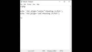
6 Effective Tips on How to Make a Website Responsive.
- designing web pages which are displayed properly in all devices of different screen sizes.
Point 1: Make web pages mobile friendly
- add to head section: <meta name="viewport" content="width=device-width, initial-scale=1.0">
Point 2: Normalize web pages
- <link href="css/normalize.css" rel="stylesheet" type="text/css"/>
*{margin:0px; padding:0px; font-family: arial; box-sizing:border-box; etc.}
Point 3: Use media queries
- media queries detect screen size and execute respective code
- use 5 media queries targeting 5 different screen sizes
/* Extra small screen devices (phones, 600px and down) */
@media screen and (max-width: 600px) {...}
OR
<link href="xs.css" rel="stylesheet" type="text/css" media="screen and (max-width:600px)"/>
/* Small screen devices (large phones and portrait tablets, 600px and up) */
@media screen and (min-width: 600px) and (max-width:768px) {...}
OR
<link href="sm.css" rel="stylesheet" type="text/css" media="screen and (min-width:600px) and (max-width:767px)"/>
/* Medium screen devices (landscape tablets, 768px and up) */
@media screen and (min-width: 768px) and (max-width:992px) {...}
OR
<link href="md.css" rel="stylesheet" type="text/css" media="screen and (min-width:768px) and (max-width:992px)"/>
/* Large screen devices (laptops/desktops, 992px and up) */
@media screen and (min-width: 992px) and (max-width:1200px) {...}
OR
<link href="lg.css" rel="stylesheet" type="text/css" media="screen and (min-width:993px) and (max-width:1200px)"/>
/* Extra large screen devices (large laptops and desktops, 1200px and up) */
@media screen and (min-width: 1200px) {...}
OR
<link href="xl.css" rel="stylesheet" type="text/css" media="screen and (min-width:1200px)"/>
Note: most commonly designers use 3 css files:
<link href="css/mobile.css" type="text/css" rel="stylesheet" media="screen and (max-width:600px)"/>
<link href="css/tablet.css" type="text/css" rel="stylesheet" media="screen and (min-width:600px) and (max-width:992px)"/>
<link href="css/desktop.css" type="text/css" rel="stylesheet" media="screen and (min-width:992px)"/>
Point 4:
- Set width of HTML elements in %
- use width property
Point 5:
- Set height of HTML elements in px
- use min-height property
Point 6:
- Set font size of HTML elements in vw unit
Note:
- replace < with less-than symbol.
- replace > with greater-than symbol.
=========================================
Follow the link for previous video:
CSS Flexbox Properties Part 2 | CSS Flex Item Properties - CSS Tutorials 101
• CSS Layouts: CSS Flexbox Properties P...
=========================================
CSS Tutorials Playlist:-
• CSS Tutorials
=========================================
Watch My Other Useful Tutorials:-
HTML Tutorials Playlist:-
• HTML Tutorials
JavaScript Tutorials Playlist:-
• JavaScript Tutorials
jQuery Tutorials Playlist:-
• jQuery Tutorials
=========================================
► Subscribe to our YouTube channel:
/ chidrestechtutorials
► Visit our Website:
https://www.chidrestechtutorials.com
=========================================
Hash Tags:-
#ChidresTechTutorials #CSS #CSSTutorial
Watch video Responsive Web Design | 6 Effective Tips - CSS Tutorial 102 online, duration hours minute second in high quality that is uploaded to the channel ChidresTechTutorials 10 May 2023. Share the link to the video on social media so that your subscribers and friends will also watch this video. This video clip has been viewed 1,040 times and liked it 57 visitors.