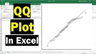
How To Create A QQ Plot In Excel
In this tutorial, I'll show you how to create a QQ (quantile-quantile) plot by using Microsoft Excel. Creating a QQ plot is a great way to visually inspect the distribution of your data. It's particularly useful to see if your data has a normal (Gaussian) distribution.
VIDEO CHAPTERS
00:00 Intro
00:18 Example data
00:33 Step 1: Rank your data
02:23 Step 2: Calculate the percentiles
03:23 Step 3: Calculate the normal theoretical quantiles
04:05 Step 4: Calculate the data Z-scores
05:21 Step 5: Create the QQ plot
07:35 How to interpret a QQ plot
08:18 Wrapping up
ONLINE GUIDE
https://toptipbio.com/qq-plot-excel/
HOW I CREATED THIS TUTORIAL (AFFILIATE LINKS)
Screen recorder & editor https://techsmith.z6rjha.net/c/198849...
YouTube SEO https://www.tubebuddy.com/SHTeach
Software (Microsoft Excel 365 ProPlus)
FOLLOW US
Website https://toptipbio.com/
Facebook / toptipbio
Twitter / toptipbio
AFFILIATE DISCLAIMER
Some of the above links are affiliate links, meaning I will earn a commission if a sale is made after clicking on the link.
Смотрите видео How To Create A QQ Plot In Excel онлайн, длительностью часов минут секунд в хорошем качестве, которое загружено на канал Steven Bradburn 24 Сентябрь 2021. Делитесь ссылкой на видео в социальных сетях, чтобы ваши подписчики и друзья так же посмотрели это видео. Данный видеоклип посмотрели 55,521 раз и оно понравилось 831 посетителям.