"How to Plot a Stress-Strain Curve in Excel | Part 2: Using Real Experimental Data"
In Part 2 of this tutorial, we continue to plot a stress-strain curve in Excel, this time using actual experimental data. Follow along as we calculate stress and strain with real-world numbers and create a precise graph to visualize the relationship. This video is perfect for engineering students and professionals looking to enhance their data visualization skills in Excel.
We'll cover:
Importing and setting up real experimental data in Excel
Calculating stress and strain
Plotting the stress-strain curve
Customizing the graph for better clarity and presentation
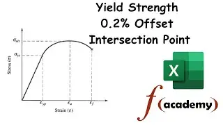
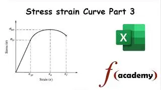
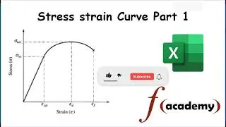
Make sure to watch Part 1 if you haven't already, and don't forget to like, subscribe, and hit the notification bell for more tutorials!
Timeline:
0:00 - Introduction to Part 2
0:30 - Overview of Real Experimental Data
2:00 - Setting Up Data in Excel
4:00 - Calculating Stress Using Absolute Referencing
5:30 - Calculating Strain
7:00 - Plotting the Stress-Strain Curve
9:30 - Customizing the Graph
11:00 - Conclusion and Summary
Tags:
#ExcelTutorial, #StressStrainCurve, #Engineering, #ExcelTips, #DataVisualization, #MechanicalEngineering, #StressAnalysis, #StrainAnalysis, #ExcelFormulas, #Educational, #EngineeringStudents, #STEM, #DataScience, #MaterialScience, #StructuralEngineering, #ExcelCharts, #ExcelGraphs, #ExcelFunctions, #StressCalculation, #StrainCalculation, #ExcelReference, #AbsoluteReference, #RelativeReference, #HowToExcel, #ExcelForBeginners, #TechnicalTutorial, #UniversityProject, #ExcelSkills, #EngineeringBasics, #ExcelGuide, #ExcelTipsAndTricks
Смотрите видео "How to Plot a Stress-Strain Curve in Excel | Part 2: Using Real Experimental Data" онлайн, длительностью часов минут секунд в хорошем качестве, которое загружено на канал Function Academy 25 Июль 2024. Делитесь ссылкой на видео в социальных сетях, чтобы ваши подписчики и друзья так же посмотрели это видео. Данный видеоклип посмотрели 325 раз и оно понравилось 6 посетителям.