Excel Pro Tips: Dynamic Images in Charts!
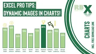
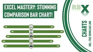
Discover the magic of dynamic pictures within Excel charts in this comprehensive tutorial. Learn how to infuse dynamic images that shift positions based on changing values within your Excel bar chart. Follow along as I demonstrate using a sales manager table, showcasing scores represented as percentages.
Witness the creation of a bar chart with conditional formatting, distinguishing the highest score with a distinct color. Experience the dynamic nature of the chart as it dynamically displays a trophy above the highest score and numerals '2' and '3' for the second and third scores, respectively. These images fluidly move and adjust as the scores change, adding a captivating visual element.
To achieve this effect, we'll dive into creating helper columns and incorporating them into the bar chart as scatter plot data points. By inserting, formatting, and replacing dots with images, you'll discover the art of crafting a visually engaging and ever-evolving Excel chart. Elevate your data presentation with dynamic images and empower your charts to tell a compelling story!
Download link to the Excel file used in the video: https://drive.google.com/uc?export=do...
0:00 - Intro
0:56 - Create the needed helper columns
2:57 - Insert the standard bar chart and add series
3:33 - Formatting the bar chart
5:09 - Add data series for the dynamic picture
5:42 - Change the chart type to combo with scatter plot
6:26 - Add the data labels
6:55 - Add the pictures to the chart
8:42 - Change settings for hidden columns and hide helper columns
Смотрите видео Excel Pro Tips: Dynamic Images in Charts! онлайн, длительностью часов минут секунд в хорошем качестве, которое загружено на канал RBX Excel videos 26 Июнь 2023. Делитесь ссылкой на видео в социальных сетях, чтобы ваши подписчики и друзья так же посмотрели это видео. Данный видеоклип посмотрели 1,980 раз и оно понравилось 50 посетителям.


![Invite - Foldarama [OVQVA003]](https://images.reviewsvideo.ru/videos/jsx3C3fiO-U)