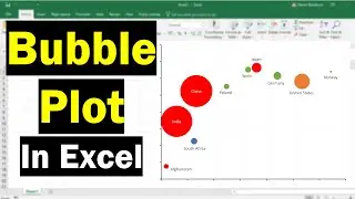
How To Create A Bubble Plot In Excel (With Labels!)
In this tutorial, I will show you how to create a bubble plot in Microsoft Excel. A bubble plot is a type of scatter plot where two variables are plotted against each other, with a third variable being used to signify the size of the dots, known as bubbles in this case
DARA SOURCES
https://www.datawrapper.de/charts/sca...
https://www.gapminder.org/data/
VIDEO CHAPTERS
00:00 Intro
00:07 What is a bubble plot?
00:42 Example data
01:29 How to create a bubble plot
02:00 Adjusting the axes
03:22 Adjusting the bubble sizes
04:08 Adding data labels
05:17 Changing the bubble appearance
06:00 Changing the axes appearance
06:36 Wrapping up
HOW I CREATED THIS TUTORIAL (AFFILIATE LINKS)
Screen recorder & editor https://techsmith.z6rjha.net/c/198849...
Software (Microsoft Excel 365 ProPlus)
FOLLOW US
Website https://toptipbio.com/
Facebook / toptipbio
Twitter / toptipbio
AFFILIATE DISCLAIMER
Some of the above links are affiliate links, meaning I will earn a commission if a sale is made after clicking on the link.
Watch video How To Create A Bubble Plot In Excel (With Labels!) online, duration hours minute second in high quality that is uploaded to the channel Steven Bradburn 24 March 2022. Share the link to the video on social media so that your subscribers and friends will also watch this video. This video clip has been viewed 117,259 times and liked it 1 thousand visitors.