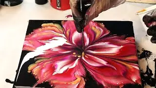
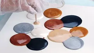
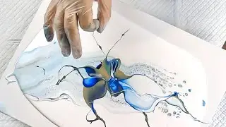
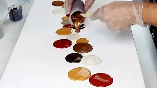
BURGANDY BEAUTY! Acrylic Swipe with Burgundy Negative space
Acrylic Pour Painting with a Burgundy Vibe. This colour palette I choose based on Burgundy as my main colour. With hints of neutral metallics and some soft pink and purple. I wanted some negative space. I accidently hit the bottom with my swipe while tilting and it stuck in the composition. I'm still happy with the way it turned out. Burgundy is one of my favourite colours!
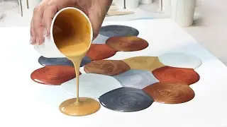
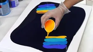
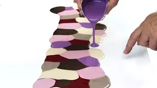
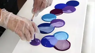
Colours
The colours listed were used to make the colours for this painting. I just kept blending colours until I was satisfied with the tone.
Mont Marte Old Mauve
Arteza Pearl Deep Brown
Amsterdam:
Vandyke Brown
Persian Rose
Ultramarine Violet
Titanium Buff White
Gold Yellow (used a tiny bit in the pink)
Carmin
Liquitex Iridescent White
DecoArt Extreme Sheen:
Champagne Gold
Antique Bronze
Website - https://fionascreativecanvas.com
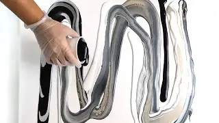
Paint Mixing Video for Acrylic Pour Swipes.
• PAINT MIXING VIDEO for the Acrylic Po...
AFFILIATE LINKS
==============
Pouring Mediums I use:
Liquitex pouring medium https://amzn.to/3m8nWFG
Paints I use:
Amsterdam Standard Series https://amzn.to/3O3S1S9
Disclaimer: As an Amazon Associate I earn from qualifying purchases.
Thank you :)
Music:
Licensed with Audiio.
Watch video BURGANDY BEAUTY! Acrylic Swipe with Burgundy Negative space online, duration hours minute second in high quality that is uploaded to the channel Fiona's Creative Canvas 25 August 2023. Share the link to the video on social media so that your subscribers and friends will also watch this video. This video clip has been viewed 75,601 times and liked it 2.1 thousand visitors.